

Bryggerikrogen
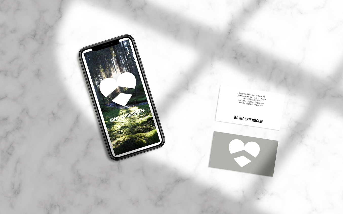
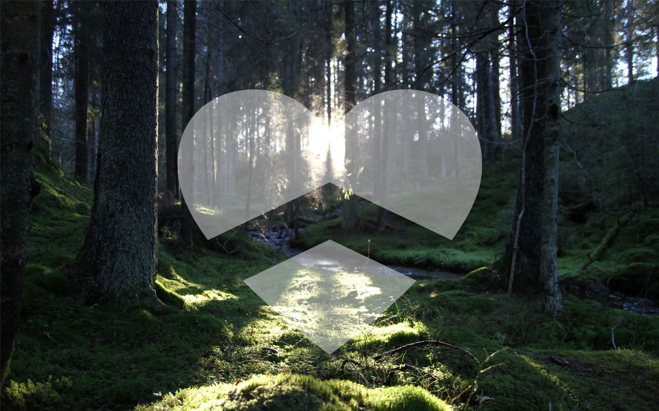
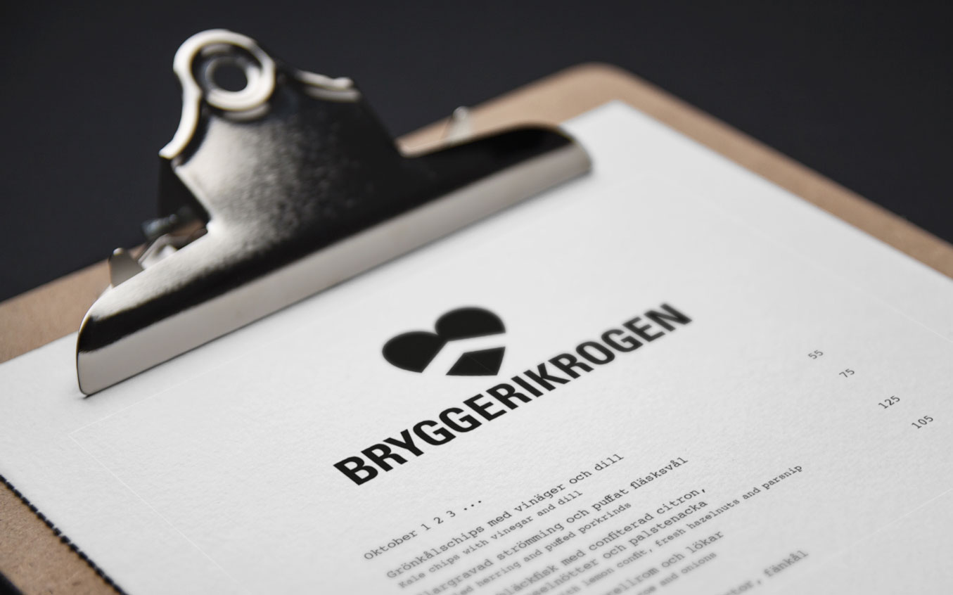
In the woods of Bergslagen in the place of use Nora, a fine dining restaurant opened up in 2015. Their founders came from backgrounds like Grythyttan, Fäviken and Mathias Dahlgren. Their visual identity was developed out of their philosphy: a natural meeting point with a big heart. The symbol consists of the letters B and K, or a heart if you so wish.
Date
21 juli, 2020